For the “International Branding” class we had to take a trip to Finland and contribute to the rebranding of a client.
Project Type
Branding · Social Media Strategy · Content Creation
Client
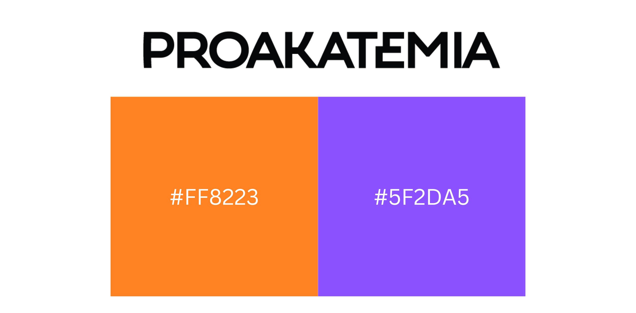
Our client was Proakatemia, a consultancy company that provides marketing students with the opportunity to collaborate with real clients. The company operates in two directions: as a training platform for students and as a marketing partner for businesses, bridging the gap between education and industry experience.
challenge
The challenge was to help Proakatemia attract more students to their program while building a strong social media presence with a cohesive and recognizable aesthetic. Since the existing logo and colors could not be changed, the focus was placed on refreshing the brand’s visual communication and content strategy within the existing identity system.

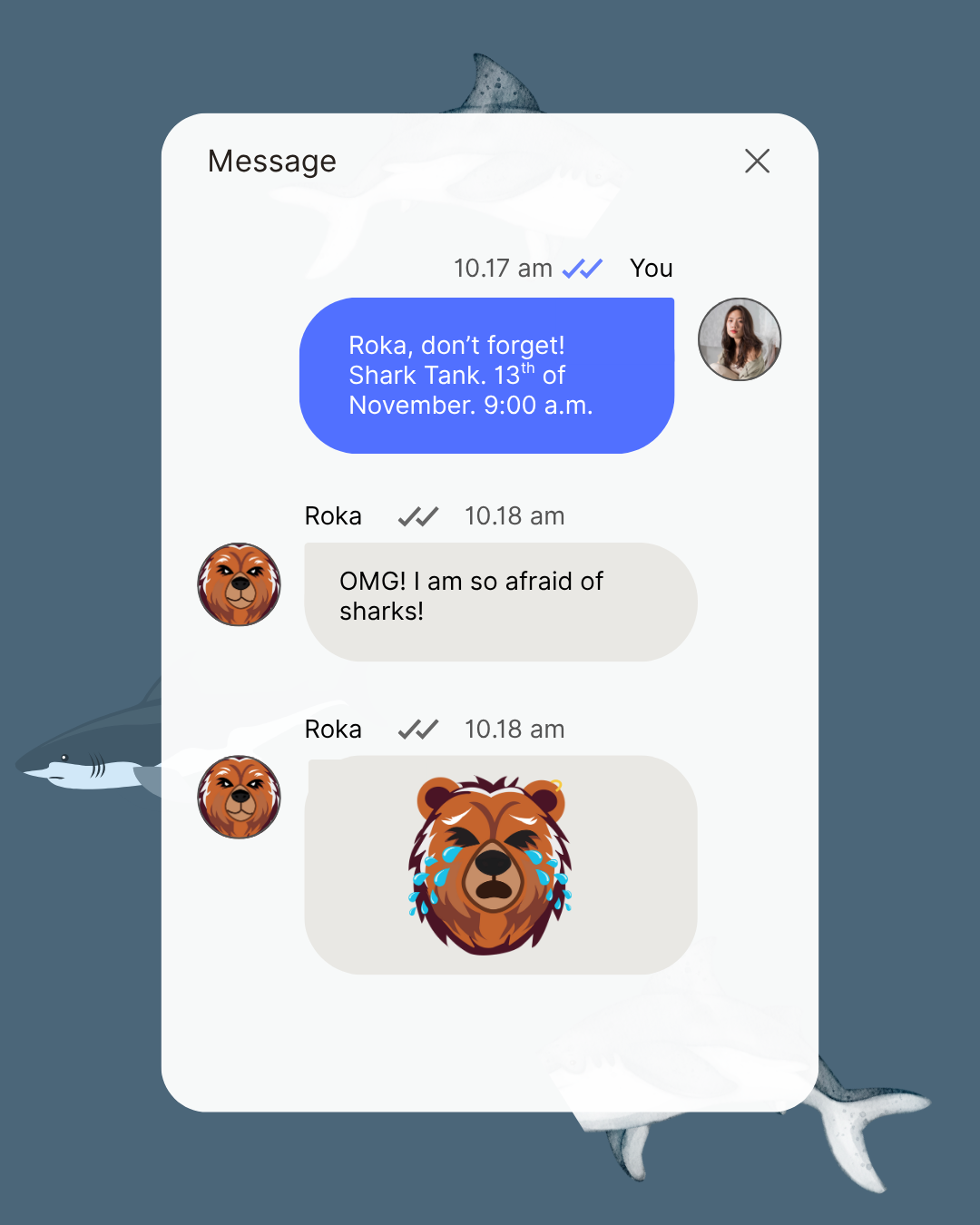
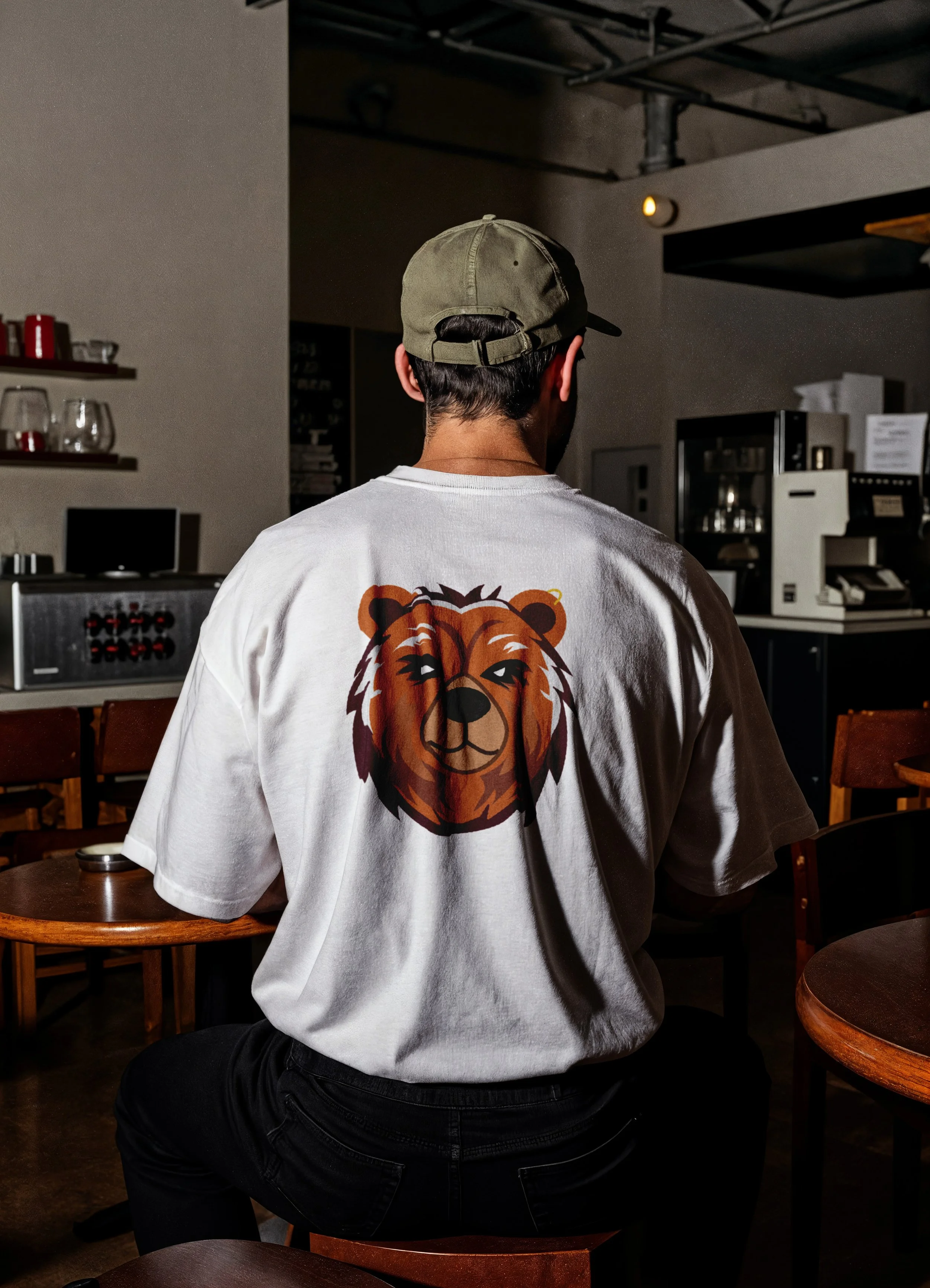
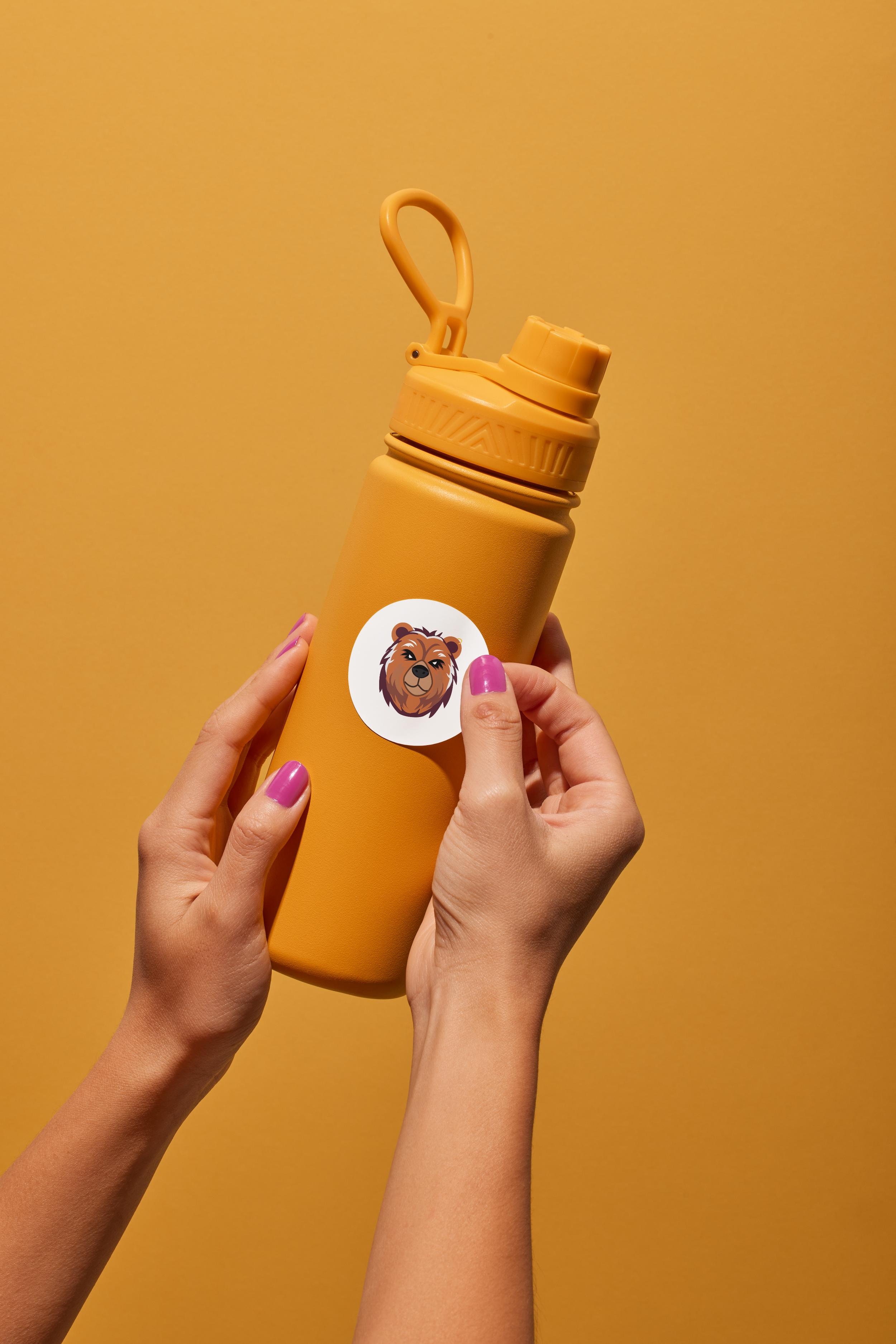
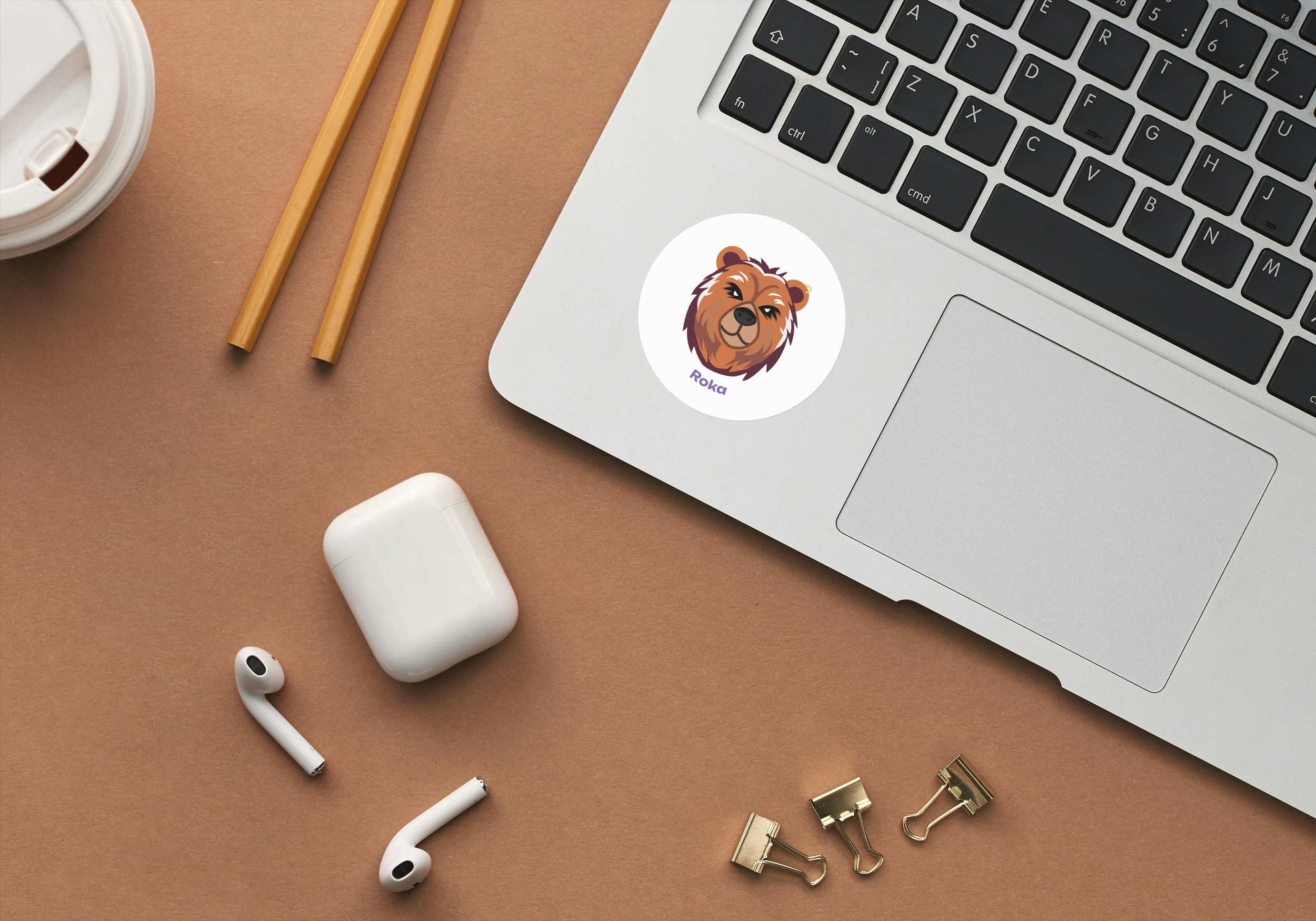
Mascot

To make the brand more appealing to a younger audience, I proposed creating a mascot that embodies the Proakatemia spirit. Roka the Bear gives the brand a relatable “face,” making it more memorable and enabling content that is fun, shareable, and engaging.
In addition, the mascot opens opportunities for more diverse and visually appealing merchandise, helping the brand extend its presence beyond social media and into everyday interactions with students.
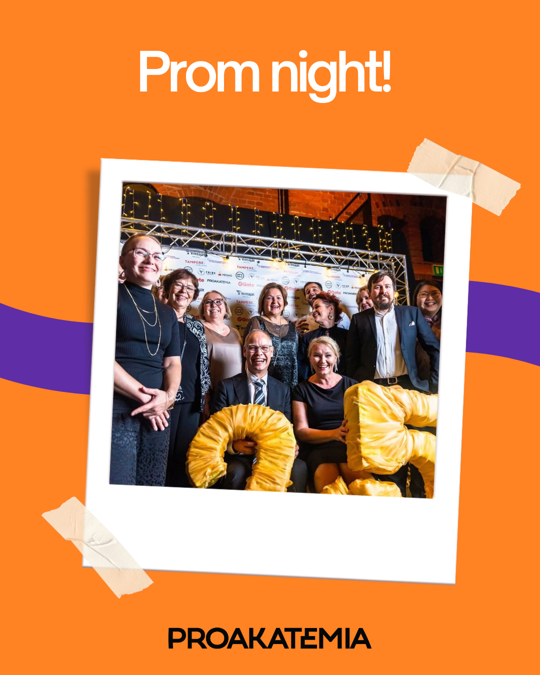
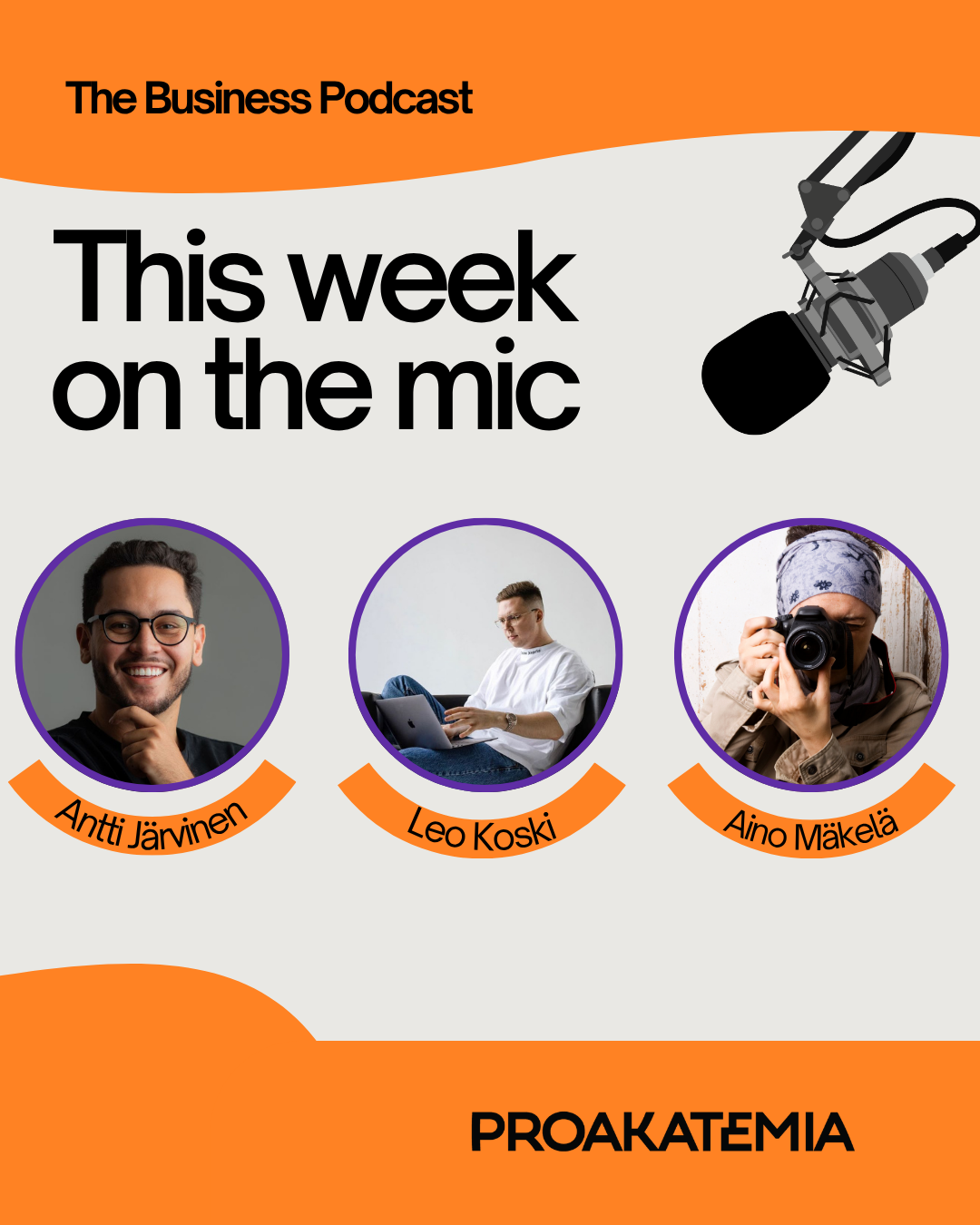
mockups


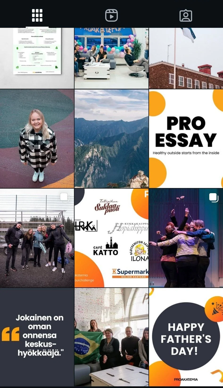
Instagram analysis
Observations about the current feed:
Inconsistent visual elements across materials
Uncoordinated color palette
Lack of a cohesive brand aesthetic
Plan:
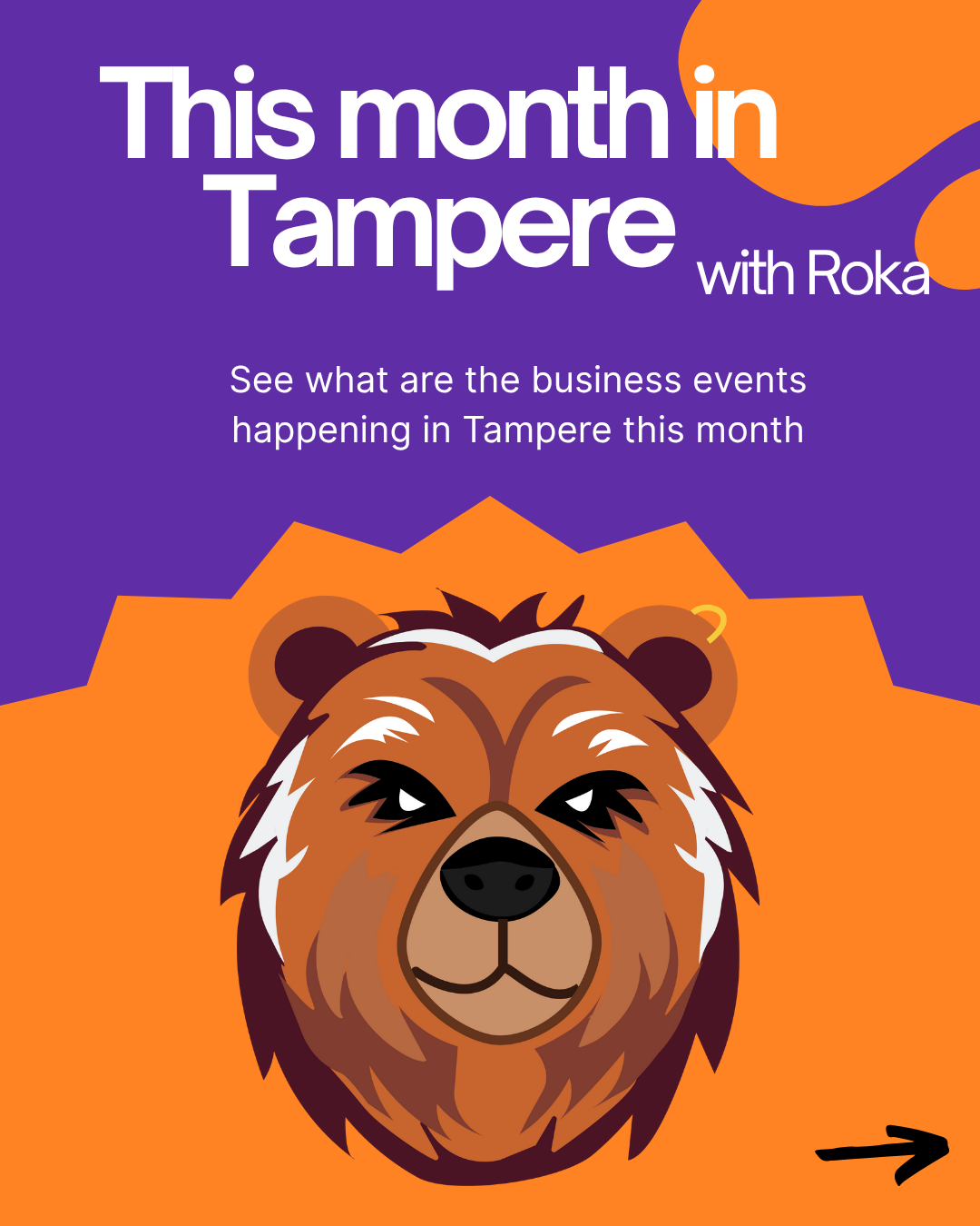
Adjust the color palette and incorporate purple.
Ensure the feed is visually consistent and aesthetically appealing.
Develop more engaging and playful ways to promote events.
Introduce Roka!
New insta feed